Clarity by Design — Reconstructing RentoMojo's Transactional Flows
A complete reconstruction of invoice billing, deposit ledger, and RentoMoney wallet — turning the #1 source of support tickets into a self-serve experience users actually trust.
My Role:
Product Designer (Sole Designer)
Team:
Sales Team Lead, Product Manager, Frontend & Backend Engineers
Timeline:
18D Design → 25D Dev → 7D QA
Skills:
Information Architecture, UI/UX Design, Systems Thinking, Stakeholder Collaboration
Context & Background
When your billing system becomes your biggest brand liability
RentoMojo is one of India’s leading furniture and appliance rental platforms. Unlike e-commerce where a transaction ends at purchase, rental businesses have an ongoing financial relationship with every customer — monthly invoices, security deposits that fluctuate as items are added or returned, advance rental balances, refunds, and wallet credits. Each of these creates a touchpoint where confusion can (and did) erode trust.
When I joined the project, the transactional experience was the company’s single largest source of customer friction. The existing system had been built incrementally over years — feature by feature, rule by rule — without ever stepping back to design a unified, user-comprehensible financial experience.
What Triggered This Reconstruction??
This wasn’t a proactive improvement — it was a fire that needed to be put out. The signals were loud and coming from every direction:

60% of Support Tickets
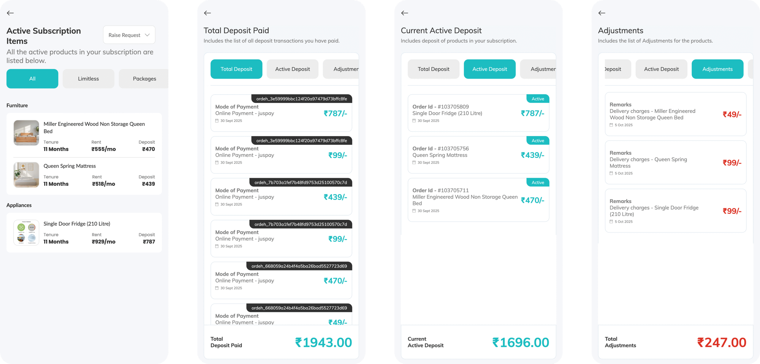
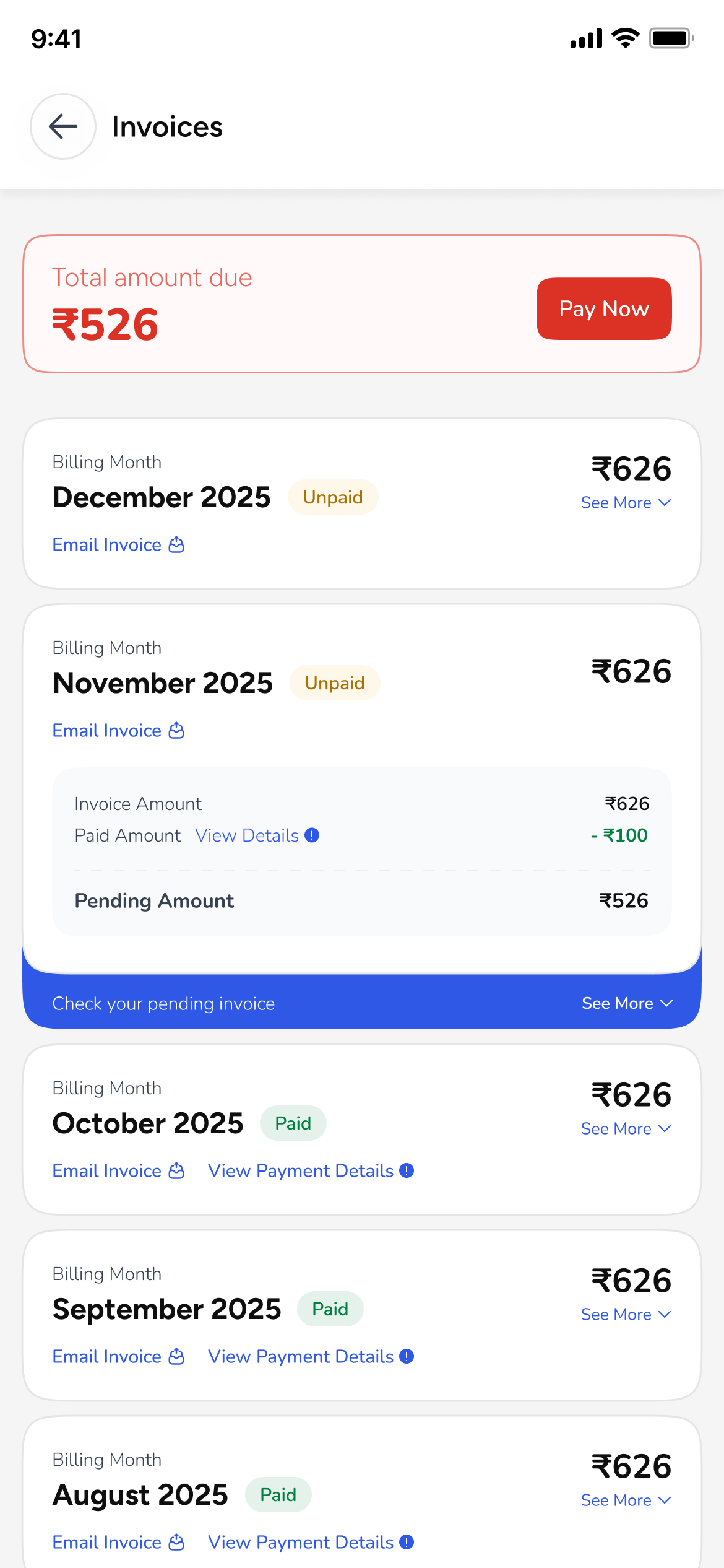
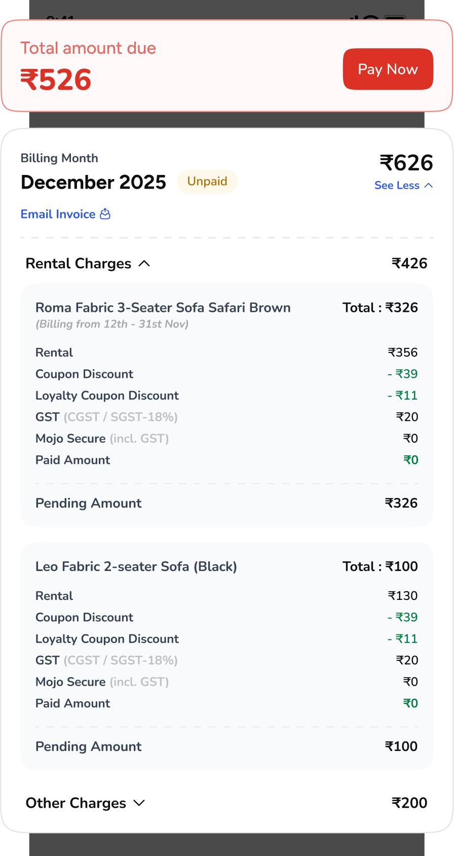
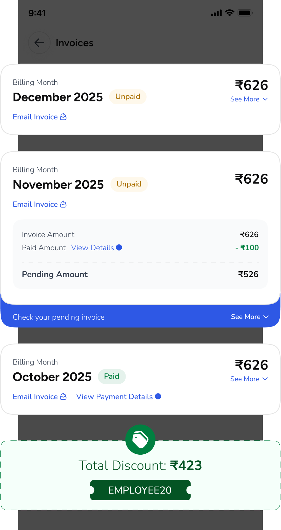
Billing-related queries dominated the support queue:
"Why was I charged this?", "Where's my deposit?",
"What is this deduction?"

Social Media Complaints
Customers were publicly posting billing screenshots on LinkedIn and Twitter, calling out confusing charges and opaque deductions.

NPS
Crater
Billing-related NPS scores had dropped to 18 (vs. 52 for product quality), dragging the overall score down significantly.

Payment
Failures
Users who couldn't understand their invoice were less likely to pay on time — creating a cascading collection problem.
The Old Experience — What Was Broken
I conducted a comprehensive audit of the existing flows by walking through every screen a user might encounter when trying to understand their billing. Here’s what I found:
- Fragmented navigation: Invoices, deposits, and wallet were accessible from different parts of the app with no unified entry point. Users had to navigate 3-4 taps deep from a red-themed sidebar menu to find basic transaction details.
- No item-level breakdown: Monthly invoices showed a lump sum with cryptic line items. Users renting 3-4 items couldn't tell which charge belonged to which product.
- Invisible deposit math: Security deposits changed when items were added, swapped, or returned — but the ledger showed only the final number with no trail of how it got there.
- Wallet confusion: The "RentoMoney" wallet combined advance rentals, referral credits, and refunds into one opaque balance. Users couldn't distinguish between money they paid upfront vs. credits they earned.
- Inconsistent visual language: Receipt screens, invoice screens, and transaction lists each used different card styles, typography, and information hierarchy — making the whole financial section feel untrustworthy.
Old screens showing fragmented navigation and confusing flows
“I’ve been trying to understand why my invoice is ₹200 more than last month. I’ve clicked through 6 screens and I still can’t figure it out.”
— Support ticket excerpt, October 2025
Goals - Making money matters crystal clear
Business
Reduce billing-related support tickets - directly saving support operations cost.
Business
Increase payment completion rate by making invoices self-explanatory and actionable.
Users
Let users understand what they're being charged for, at the item level, without contacting support.
Users
Provide complete deposit and wallet transparency - every rupee in, every rupee out, fully traceable.
Research & Discovery - Understanding the depth of the confusion
Support Ticket Analysis
Working with the Sales Team Lead, I categorized 3 months of billing-related support tickets (approx. 2,400 tickets). The top complaint categories were:
User Interviews (8 participants)
I conducted 30-minute remote interviews with 8 active RentoMojo users across Delhi NCR and Bangalore — a mix of single-item and multi-item renters. Key findings:
7/8
Users could not correctly explain what their most recent invoice was charging them for, even when looking at the screen.
6/8
Users did not know the difference between their security deposit and their RentoMoney wallet balance.
5/8
Users had contacted support at least once about a billing question that should have been self-serve.
0/8
Zero users could explain how their deposit amount was calculated or what adjustments had been made to it.
“I pay every month but I genuinely have no idea what I’m paying for. I just trust it’s correct because returning everything is a bigger hassle.”
— Participant 4, multi-item renter, Bangalore
“RentoMoney sounds like fake money. I have ₹10,000 sitting there and I’m scared to use it because I don’t know if it’ll mess up my deposit.”
— Participant 7, Delhi NCR, 14-month customer
Competitive Benchmarking
I analyzed billing experiences across rental platforms (Furlenco, CityFurnish, Rentickle) and subscription services (Swiggy One, Zepto Pass, Netflix). The best-in-class experiences all shared three traits: item-level transparency, chronological transaction history, and clear visual distinction between credits and debits. None of the competing rental platforms excelled here — this was an opportunity to set a new standard.
Technical Constraints
A critical challenge emerged early: the backend billing engine had complex, layered rules built over years — proration logic, mid-cycle swaps, deposit adjustment formulas, and wallet deduction priorities. I couldn’t just design an ideal UI and hand it off; I had to deeply understand the backend rules to ensure the UI accurately represented what was actually happening. This led to multiple iterations with the engineering team to align what users see with what the system computes.
Design Solution
Three interconnected systems, one unified language
Rather than patching the existing screens, I proposed a ground-up reconstruction of all three transactional pillars — with a shared visual language, consistent information hierarchy, and a design system that could accommodate the backend’s complexity without overwhelming the user.
Monthly Invoices
Item-level breakdowns, clear paid/unpaid states, expandable charge details, and a chronological invoice history.
Deposit Ledger
Full transaction trail — every adjustment, addition, and refund traced per item with running balance.
RentoMoney
Unified wallet view with advance rental breakdown, credit/debit history, and item-level allocation.
Pillar 1 — Monthly Invoices
Invoice Listing Screen:
The invoice redesign was the highest-impact piece. I restructured the entire invoice from a flat, opaque document into a layered, item-aware breakdown that answers the question: “What am I paying for, and why?”
A clean chronological list of all monthly invoices, each showing the month, total amount, and a clear Paid (green) or Unpaid (red) status badge. Unpaid invoices surface a “Pay Now” CTA directly in the list, reducing the taps-to-payment to just two. Below each entry, a secondary line shows linked items and any pending amounts — giving users enough context to decide whether to drill in or just pay.
Invoice Detail — Item-Level Breakdown:
This was the core innovation. Each monthly invoice now breaks down charges per rented item — showing the product image, name, and a collapsible section with every individual charge: base rental, fabric charges, delivery charges, late fees, damage deposits, and more. Users renting multiple items can finally see exactly which product is costing what.
Below the item breakdowns, an “Other Charges” section captures platform fees, insurance, and any adjustments. The invoice ends with the total due, any applicable discounts (shown in a green success card with the savings amount), and a prominent “Pay Now” button.
Invoice States & Edge Cases:
I designed for multiple invoice states: fully paid, partially paid (with pending amount highlighted), overdue, and discount-applied. The “Initiate Payment” flow was also redesigned — for overdue invoices, a contextual message explains the pending amount and any late fees before the user confirms payment.
Validation & User Feedback
Usability Testing (Pre-Launch) :
I ran moderated usability tests with 6 participants — mixing single-item and multi-item renters. Tasks included: finding a specific charge on their latest invoice, understanding their deposit balance, and explaining what their RentoMoney balance represented.
Post-Launch Metrics
I conducted 30-minute remote interviews with 8 active RentoMojo users across Delhi NCR and Bangalore — a mix of single-item and multi-item renters. Key findings:
25%
Billing Support Tickets
↓ from 60% of total volume
2.3x
Payment Completion Rate
On-time invoice payments
+34pts
Billing NPS Score
↑ from 18 to 52
50 Days
Concept → Production
Design · Dev · QA
“Finally, I can actually see what I’m paying for each item. This is how it should have been from the start.”
— App Store review, 3 weeks post-launch
“The deposit tracking is a game-changer. I used to have no idea where my ₹15,000 deposit went, now I can see every adjustments.”
— User feedback via in-app survey
Reflections & Learnings
What 50 days of rebuilding trust taught me
- Transparency is the best UX - The most impactful design decision wasn't a visual one — it was the information architecture choice to break every financial number into its traceable components. When users can see the math, they trust the system.
- Design with the backend, not against it - Understanding the billing engine's rules wasn't optional — it was the design work. The 6 iterations weren't failures; they were the process of aligning what users need to see with what the system actually computes.
- Support tickets are a design research goldmine - Categorizing 2,400 tickets gave me a more accurate picture of user pain than any survey could. The complaints wrote the design brief.Categorizing 2,400 tickets gave me a more accurate picture of user pain than any survey could. The complaints wrote the design brief.
- Ship modularly, iterate continuously - Building the design system to be modular meant we could ship the invoice redesign first, then layer in the deposit ledger and wallet — without waiting for everything to be perfect.